Live examples
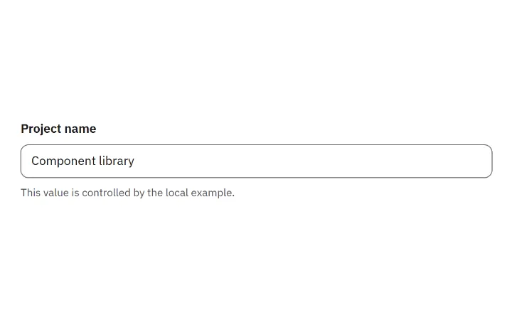
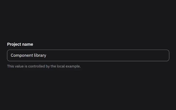
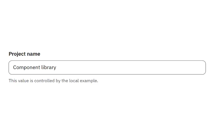
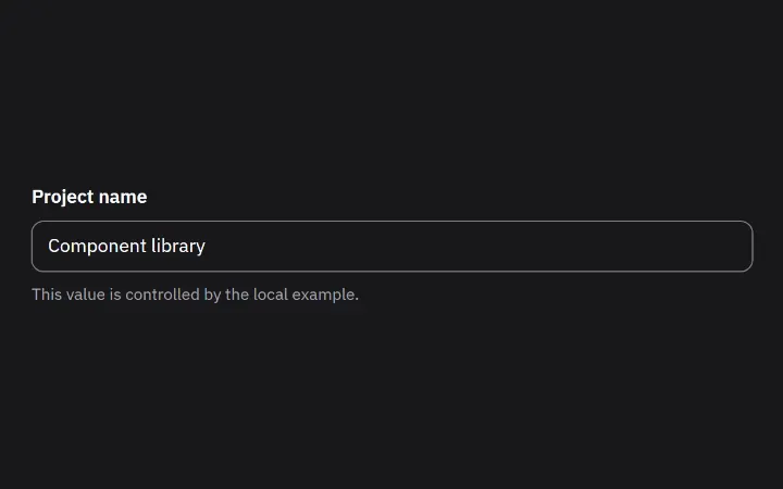
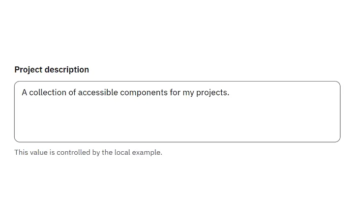
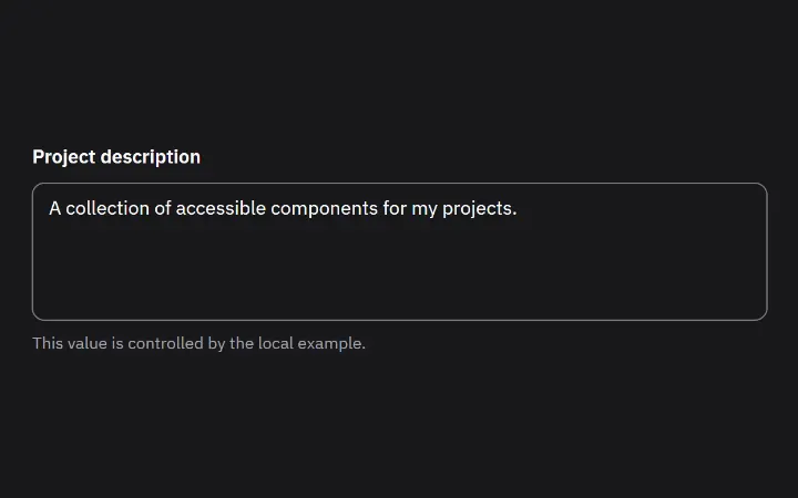
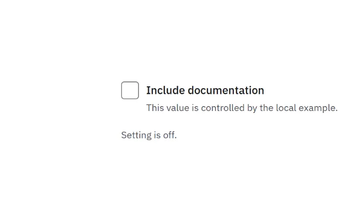
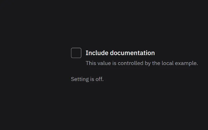
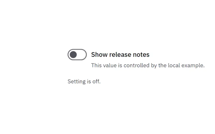
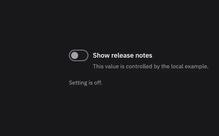
This value is controlled by the local example.
The components
- FieldA shared label, description and validation message around a form control.
- InputA text input that works with Field and your own validation.
- TextareaA native multiline field for descriptions and longer written content.
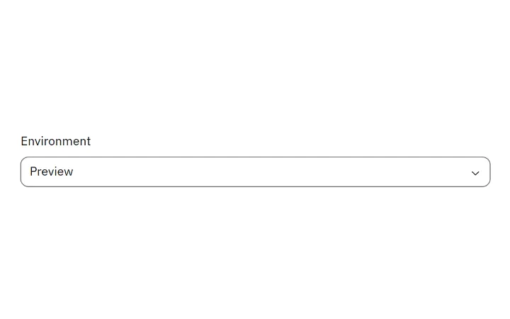
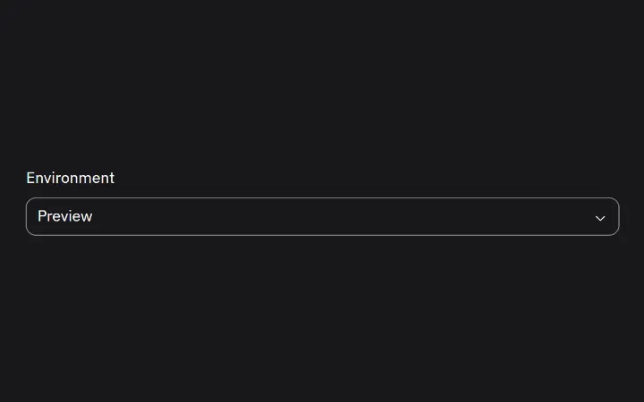
- SelectA dropdown for picking one option, with full keyboard support.
- CheckboxA checkbox, including a mixed state for partly selected groups.
- SwitchAn on/off setting with a label.
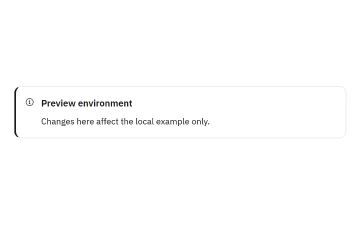
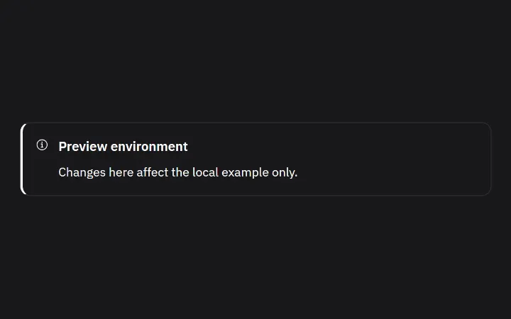
- AlertA message that stays on the page, with a tone, optional actions and a choice of how urgently screen readers hear it.
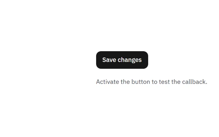
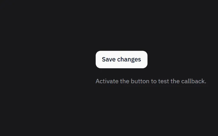
- ButtonA labeled action in a few sizes and levels of emphasis.
Imports
Install once with npm install @stackunseen/ui, then import what you use.
tsx
import { Field, Input, Textarea, Select, Checkbox, Switch, Alert, Button } from '@stackunseen/ui';
import '@stackunseen/ui/styles.css';
See them working together in SaaS admin.